


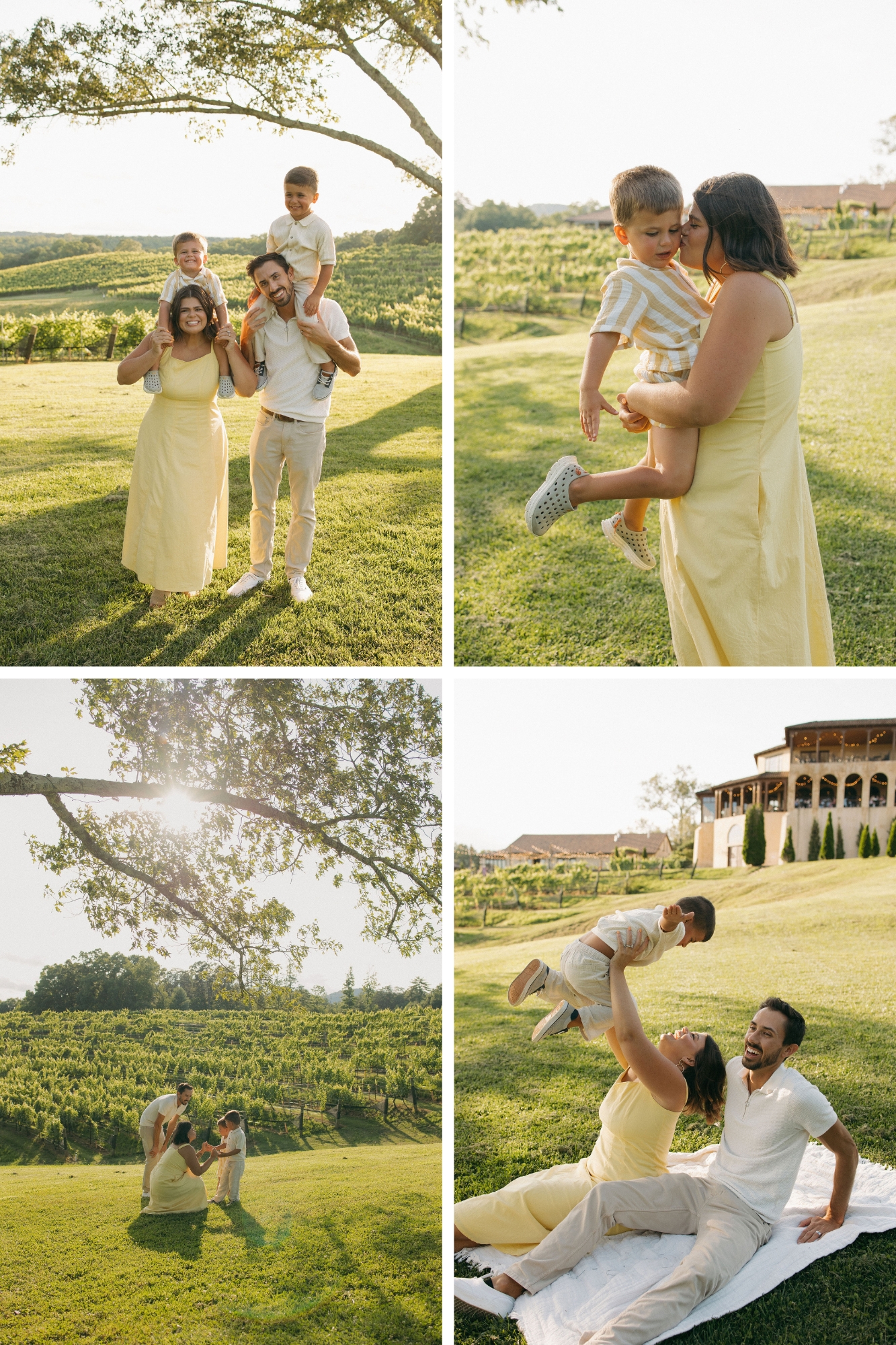
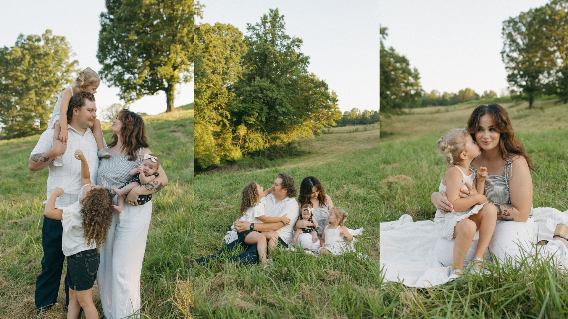
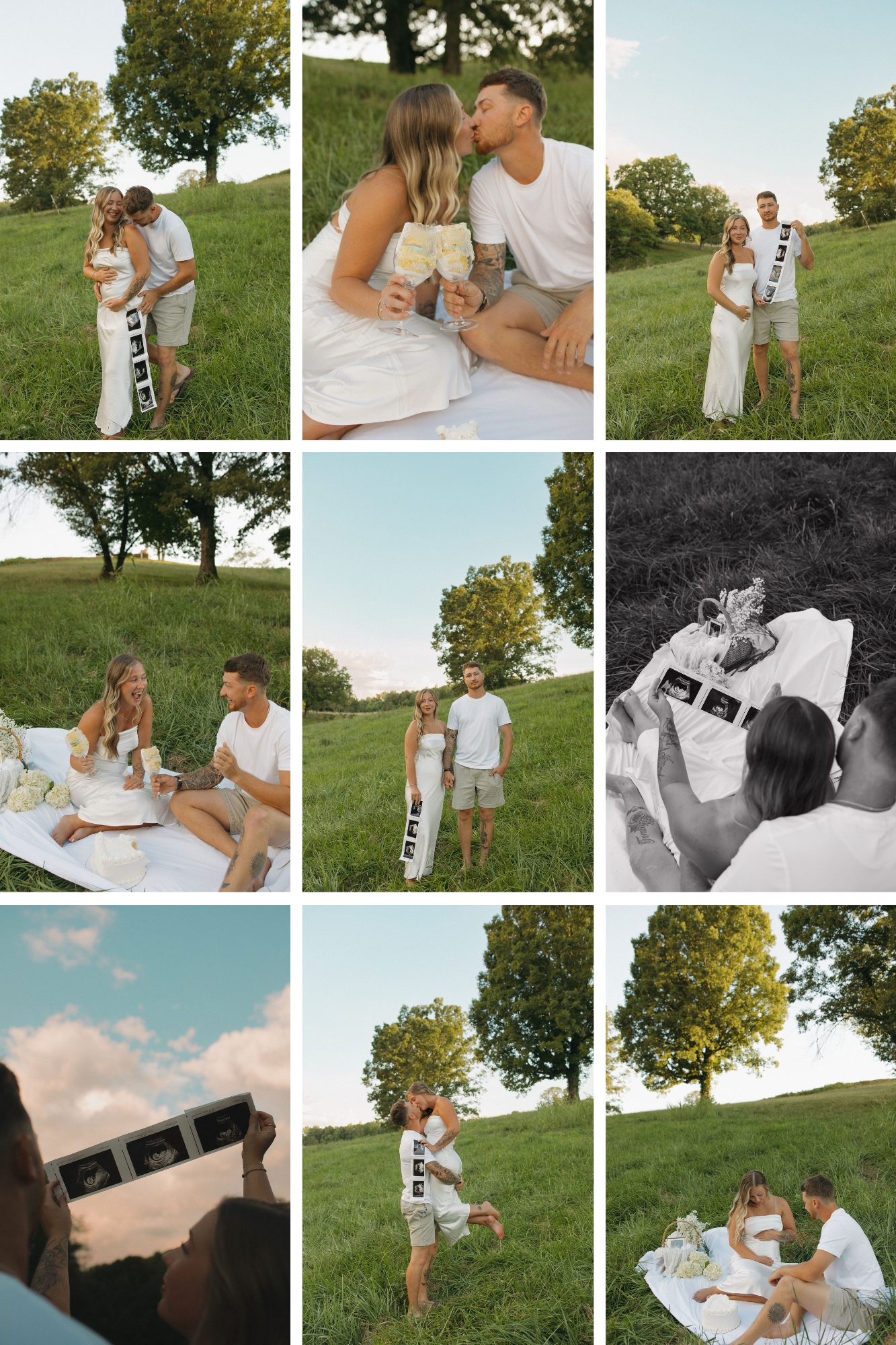
Colors have a powerful effect on how you look and feel in photos, so choosing the right shades is key when deciding what to wear for photos. Picking colors that enhance your natural features can make your skin glow, your eyes pop, and your overall presence more vibrant on camera. While it’s true that different complexions can look great in certain tones, I personally love it when my clients wear mostly neutrals and earthy colors, think creams, beiges, rusts, olives, and other soft, natural hues. Muted blues and greens also photograph beautifully and add a subtle pop of color while still keeping things timeless and cohesive. Don’t forget that hair and eye color also influence which shades will stand out most. Wearing colors that flatter your features not only improves how you appear in photos but also boosts your confidence, helping you feel relaxed and authentic during the session.
Choose Colors That Flow Together
Instead of everyone wearing the exact same outfit, focus on selecting colors that complement each other. Pick two to four shades that work well together and spread them thoughtfully across your family or group. For example, soft neutrals like cream, beige, or gray can serve as a base, while muted blues, greens, or blush tones add subtle contrast. This approach lets each person’s personality shine while keeping the overall look polished and cohesive. Planning your palette ahead of time helps avoid last-minute mismatches and ensures your photos feel intentional, and timeless.
Add Depth With Layers and Patterns
Layers and textures are one of the easiest ways to elevate your outfits and add variety when thinking about what to wear for photos. Sweaters, jackets, vests, scarves, or cardigans can create dimension while giving you options to change up your look quickly. Different textures, like knits, linen, denim, or corduroy, add visual interest without overwhelming the image. Even subtle patterns, such as thin stripes, small florals, or delicate checks, can break up flat colors and make photos more dynamic. Thoughtful layering not only enhances the visual appeal of your outfit but also allows you to adapt to weather, lighting, or background changes, ensuring you always look polished and put together.
Consider the Location’s Mood When Deciding What to Wear for Photos
The environment of your photoshoot can influence which colors will look best on camera. Outdoor settings like parks, beaches, or fields often complement soft, earthy tones or pastels, which blend naturally with greenery, sand, or flowers. Urban or studio shoots, with neutral or minimal backgrounds, may benefit from bolder colors or deeper shades to create a striking contrast. Seasonal factors should also guide your choices, for example, light, airy colors in spring and summer, warm, rich tones in fall, and cool or muted shades in winter. Aligning your outfits with the location ensures that your photos feel cohesive, intentional, and harmonious with the surroundings.
When planning outfits for your photos, remember that the goal is to highlight the people and the connections between them. Choosing colors that look good together and keeping patterns simple helps your photos feel timeless and put-together. Thoughtful planning lets everyone’s personality shine while keeping the attention on genuine emotions and interactions. By focusing on coordinating outfits rather than flashy trends, your images will capture memories you’ll love for years to come.
Kind Words
Very grateful for my session with Taylor! She does such amazing work, and her spirit is beautiful. She is quick and so sweet to work with! I recommend you book with her if you want a session full of laughs, fun, and smiles. My boyfriend and I fell in love with the photos she captured of us with our pups!


